Pic: Midjourney
Editors' Note: Many Fast News images are stylised illustrations generated by Dall-E. Photorealism is not intended. View as early and evolving AI art!

Branding Ballarat,
'Brilliantly Unexpected',
Past and present meet.

US+US unveils 'Brilliantly unexpected' branding for Ballarat
Brand agency US+US has developed a new brand positioning, identity, and campaign platform for Ballarat, Victoria's largest inland city. The new brand, dubbed 'Brilliantly Unexpected', aims to reframe Ballarat as a destination where the past and present, tradition and creativity collide in unexpected and harmonious ways. The project, which took two years to complete, began with an audit of existing strategic and creative assets, followed by a period of research and consultation.
The process revealed key challenges for the region around entrenched visitor and local attitudes, but also uncovered an untapped insight: Ballarat is a place of glorious contrast and contradiction. The new brand platform highlights four key pillars of the Ballarat brand: First Peoples, people and place (185+ years of post-settlement), creative energy, and signature experiences.
"Destinations need to create brands that truly reflect their unique character. Ballarat has been pigeon-holed as a gold rush town, but it’s so much more – a progressive, self-assured city embracing its distinctiveness, diversity, and eclectic nature. A brand was needed to reflect today’s Ballarat, something all Ballaratians can get behind," said Jim Ritchie, US+US Strategy Director and Partner.
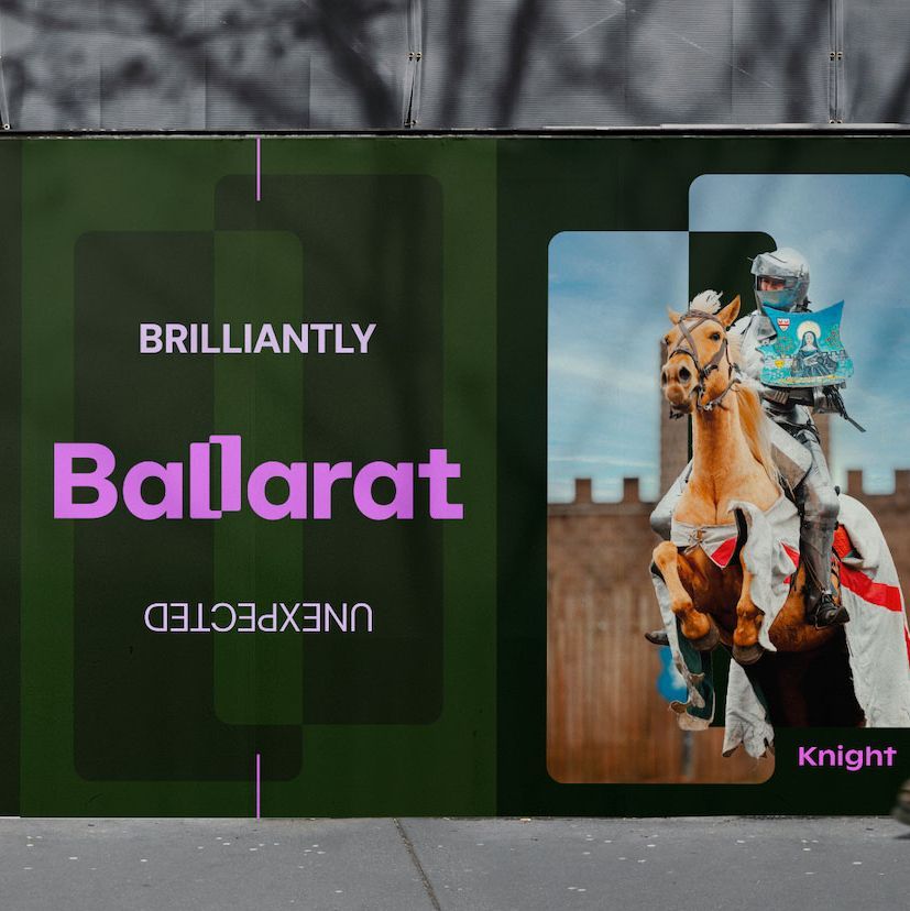
The new Ballarat logo takes its inspiration from the contrasts of the area, people and experiences which are reflected by a double-L ligature that also forms a versatile graphic device. The Ballarat colour palette is designed to cater for the abundance of contrasts and diversity in the region, leveraging the unexpected.
"From the start, we set out to create a vibrant and dynamic identity for Ballarat that embodies the positively unexpected experiences the region offers. Ballarat’s inherent contradictions are front and centre in the wordmark with the two Ls contrasting against each other and forming a distinctive device that flows through the entire identity," said Tom Hutcheon, US+US Design Director and Partner.
US+US worked closely with Tourism Midwest Victoria and local stakeholders to develop an expansive and integrated brand framework that supports the visual and verbal identity. "It’s been hugely rewarding to work with Tourism Midwest Victoria’s marketing team and local stakeholders to develop an expansive and integrated brand framework that supports the visual and verbal identity. This approach has enabled us to create and maintain a consistent brand narrative across all facets of the brand, marketing and creative initiatives," added Ritchie.
"The ‘Brilliantly Unexpected’ brand platform and new identity truly highlight our region’s distinct essence and personality. At every step, US+US has stayed true to the vision, ensuring our brand platform is as distinctive and compelling as the people and places it represents. We believe ‘Brilliantly Unexpected’ will perfectly position us as Victoria’s leading regional destination. We can’t wait to share this with the world," said Hon. John Pandazopoulos, Tourism Midwest Victoria Chair.


