
Pic: Midjourney
Editors' Note: Many Fast News images are stylised illustrations generated by Dall-E. Photorealism is not intended. View as early and evolving AI art!

Triple J's new beat,
Dynamic, youthful, and fresh,
Echoes in the street.

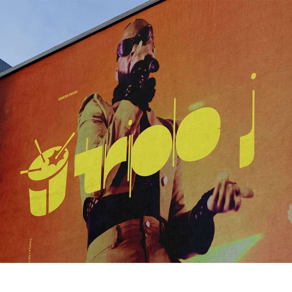
Triple J beats to a new drum, unveils dynamic brand identity
Triple J, the national youth broadcaster, has unveiled a fresh brand identity, including an updated logo and design system. The rebranding was executed in partnership with Howatson+Company, and aims to reflect the ever-changing sounds of Triple J.
The dynamic new design utilises Triple J's evolving sounds to create a custom variable typeface that changes based on audio and musical inputs, using algorithmic machine learning. This typeface has been used to generate unique titles across Triple J's content offering. The drum, a key element of the brand, has been updated to reflect the tastes of the station's youth audience today.
"Triple J is part of the fabric of Australia's youth culture, and it was time for the brand to evolve and reflect this generation, today. The refreshed visual identity is born from the dynamic content that Triple J continues to offer and One Night Stand was the perfect way to introduce the new brand identity to young Australians that was uniquely Triple J," said Karen Madden, (Acting) Director of Audiences at ABC.
The new brand identity was launched at Triple J's music festival One Night Stand and will continue to be rolled out across all assets in October. The rebrand aims to refresh Triple J's visual world while preserving its core identity as a champion of youth culture and new Australian music.
"Triple J isn't just a radio station. It's the thudding 150 BPM heart of Aussie youth culture. It blasts on phones, laptops, in cars and on stages. Gflip's even got the logo tattooed on their ankle. Our design system is made to reflect this energy. Always changing, always relevant. Able to keep up with the changing tastes of gen-z, gen-alpha, or gen-whatever-the-hell-comes-next," stated Gavin Chimes, Chief Creative Officer at Howatson+Company.
Since 1975, national broadcaster triple j has served as a lighthouse for young Australians, actively pushing culture forward and challenging norms through its disruptive programming, shows and events. Yet for the last 15 years, the brand and logo have remained static.
From the new drum logo to the bespoke typeface to the grid system and colour palette, every part of the brand was considered and crafted, Howatson +Company said.
"This project has been a true balancing act - honouring the brand's heritage whilst resonating with youth culture today. From the new drum logo to the bespoke typeface to the grid system and colour palette, we considered and crafted every part of the brand. We're immensely proud of the new Triple J identity, which will continue to play a vital role in promoting Australian music and culture for years to come," said Ellena Mills, Head of Design at Howatson+Company.


