
Image cropped Pic: Midjourney
Editors' Note: Many Fast News images are stylised illustrations generated by Dall-E. Photorealism is not intended. View as early and evolving AI art!

Novon's new dawn breaks,
Innovation lights the way,
A bright future wakes.

Novon unveils new brand identity from Studio 3AM
Australian lighting company Novon has undergone a comprehensive rebrand to align with the business' updated vision of sustainable innovation and manufacturing excellence.
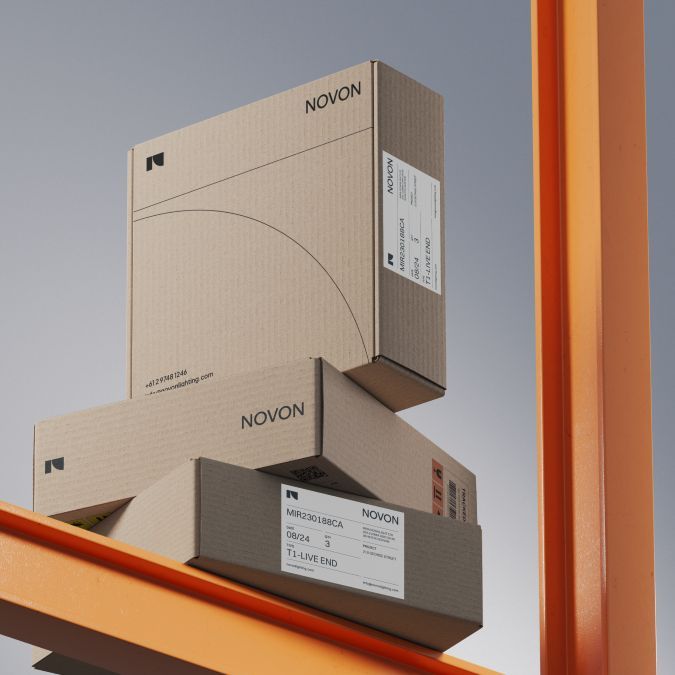
Delivered by Studio 3AM, the rebrand began with a new name. 'Novon', merges 'Nov' from the Latin word for 'new', and 'on', reflecting the company’s commitment to ongoing innovation. The palindromic nature of the name 'Novon' emphasises the company's dedication to circularity, locally sourced materials, and waste minimisation.
Novon's new logo subtly forms an 'N' using two geometric shapes, with the negative space suggesting an upward trajectory. The visual identity employs curved and straight grid lines for lightness and balance, referencing the geometric forms in the logo and the technical precision in Novon's products. A bold colour palette, combining primary and secondary colours with white, creates illuminating gradients that visually represent spaces being lit.
Novon's new brand personality employs two font families: Plus Jakarta Sans, a geometric sans serif, and Switzer, a neo-grotesk sans serif.
Marketing & Communications Specialist at Novon, Nick Grieco, said: "Studio 3AM came highly recommended, and they exceeded our expectations. Their enthusiasm, values, and personalities perfectly aligned with our business. The discovery sessions were invaluable, and the name 'Novon' truly represents our future."


