
Pic: Midjourney
Editors' Note: Many Fast News images are stylised illustrations generated by Dall-E. Photorealism is not intended. View as early and evolving AI art!

Brand reborn anew,
Poronui's tale retold,
Part of something true.

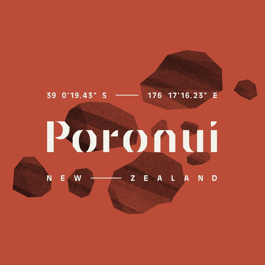
Principals revamps luxury sporting lodge Poronui's brand identity
Branding design agency Principals has developed a new brand strategy, story, and identity for Poronui, a luxury sporting lodge located in the Taharua Valley. Poronui offers world-class hunting, fly fishing, and driven wing shooting, complemented by premium hospitality and gourmet New Zealand cuisine.
In the wake of Covid-19, Poronui embarked on a reboot, upgrading its facilities and ramping up offshore marketing to elevate its luxury offer. The rebranding process began with a two-day immersion, including a workshop with the estate’s management team and Tom Loughlin, a local cultural advisor. The workshop covered the location’s Māori and post-colonisation history, Poronui’s establishment and growth, its unique client makeup, and the business’ commitment to long-term sustainability and eco best practices.
The brand strategy is founded on the idea – ‘Part of something bigger’ which comes from the name: Poro, meaning ‘part of’, and Nui, ‘the biggest part, great, abundant, important’. This idea is reflected in Poronui’s location with the estate making up the largest part of the Taharua valley and extends to Poronui’s relationship with the wider community and a commitment to stewardship (tiakitanga) of the property and resources.
"'Part of something bigger' is a story of the care, shelter and sanctuary that Poronui offers. This is cemented by the brand’s 'Shelter' icon that captures the property’s dominant pitched rooflines. The typography is inspired by the carved walls in the heritage ‘Red Hut’, while the location coordinates highlight its unique geographical position," says Jodine Bell, Principals Creative Director.
The brand assets draw heavily from the natural environment, combining hand-drawn textural patterns and illustrations with a rich kōkōwai (red ochre). Poronui’s rivers were important Māori trading routes for the precious pigment which is why it is the dominant colour of the architecture.
"With Principals’ help, our brand now reflects a deep commitment to luxury, heritage and sustainability. This will help us to attract a younger, affluent demographic interested in culturally rich and sustainable experiences, allowing us to further boost the regional economy and ensure sustainable benefits for the wider community," says Carla Hruszczak, Poronui Marketing Coordinator.


